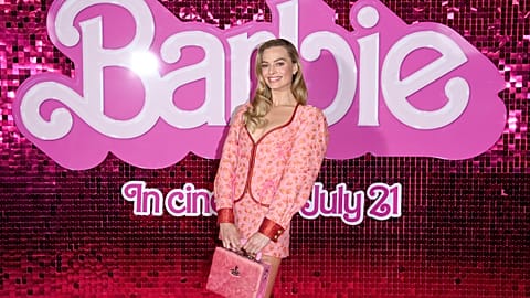


The 'Barbie' posters and trailer came out this week. But what can Barbie tell us about modern movie poster trends?
Life in plastic, it is fantastic…
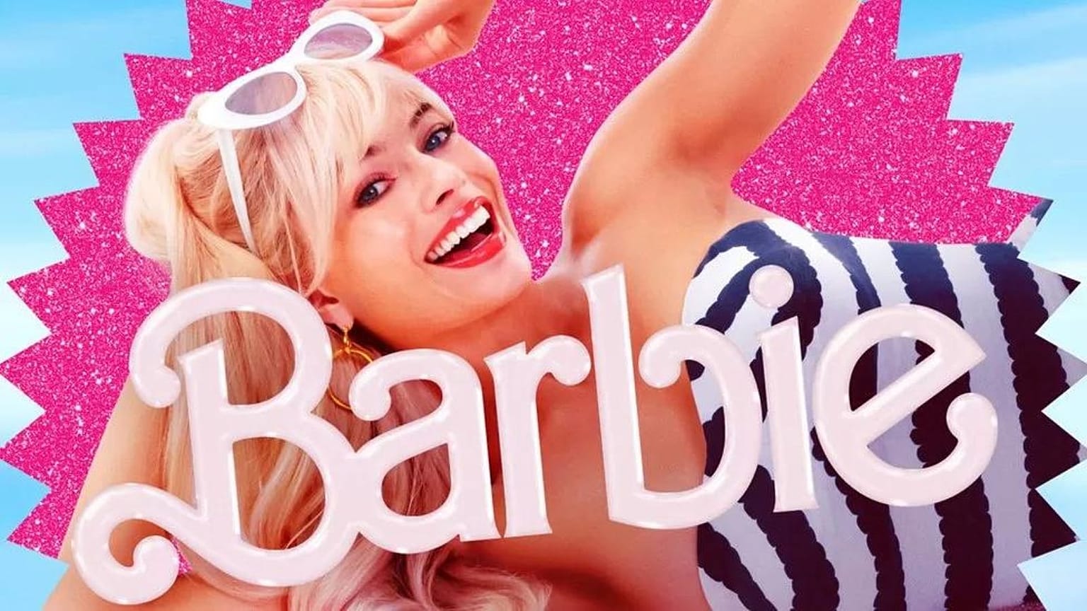
In case you hadn’t noticed, the Barbie film is coming, and this week saw the release of the posters and brilliant main trailer for Greta Gerwig’s Mattel adaptation.
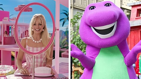
The entire cast has now been unveiled, even if the Barbie plot is still under wraps. The film is believed to follow Margot Robbie's Barbie and Ryan Gosling’s Ken (with Gosling looking a lot like Ellen, it has to be said) as they stumble into the real world.
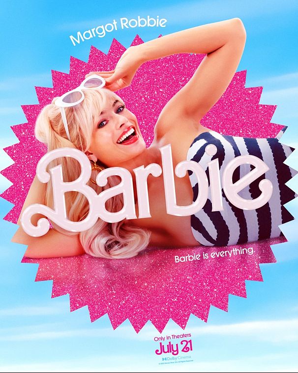
The posters also provide a first look at Helen Mirren as the narrator, Will Ferrell as a Mattel CEO (confirming that we’re in for some Lego Movie -style meta glory) and Michael Cera as Allan. Because “there’s only one Allan.”
The eye-catching posters, which make the most of the Mattel logo and some garish colour palettes that seem perfectly on brand with the source material, confirm that Robbie and Gosling are far from the only Barbie and Ken dolls in the movie.

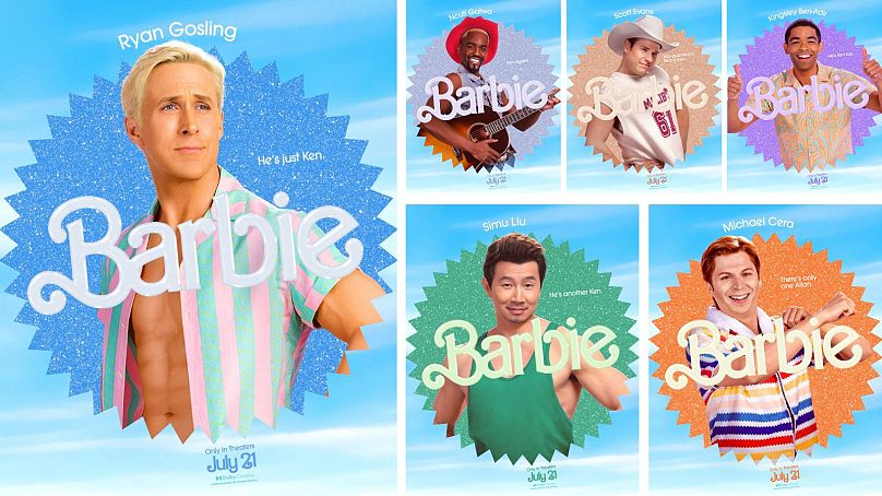
The advertising is great, as it not only perfectly sells the film, but also uses a vibrant colour palette and humour – the running joke being that each Barbie actor is playing a version of Barbie that has a unique profession (while all of the Ken actors are simply just playing Ken).
This marketing got us thinking about how the poster remains an essential medium for the promotion of the film. Before you check out trailers or buy any tickets, a great number of moviegoing decisions are made – often subconsciously – with marketing images. Because make no mistake: a good movie poster is the first line of defence against a cinemagoer’s better judgement.
Some bank on originality, others are over-designed, while many are just plain awful.
There are reliable formulas poster designers rely on and some of these tropes have become ubiquitous over the years.
Here are some of the main poster trends that you may recognize and, in some cases, really need to end.
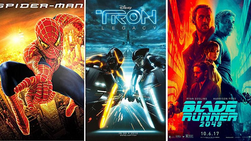
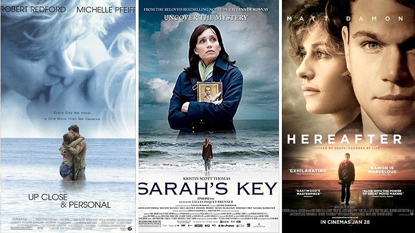
THE BLUE & ORANGE UBIQUITY
There are entire books to be written about the psychology of movie posters, specifically colour theory.
To boil things down, the main schemes are the joint use of red and white, which evokes energy and love (usually used for comedies and romcoms), and blue is the dominant colour you’ll find on most movie posters. It is overwhelmingly favoured by designers, used for principally for thrillers (showing suspense). You’ll also find posters using a combination of blue and orange (or black and orange), a colour combination that has become the perfect shortcut for a wide variety of genres because the gradient dichotomy works.
The common denominator, orange, evokes explosions and excitement, while blue and black act as contrasting colours. This doesn’t limit itself to posters. When editors are colour grading films, they also tend to highlight orange and blue / black for the sake of contrast.
While there’s nothing wrong about the use of these colours, their ubiquity on posters means that a lot look exactly the same.
Verdict: Functional, but it’s getting old.
BACK TO BACK
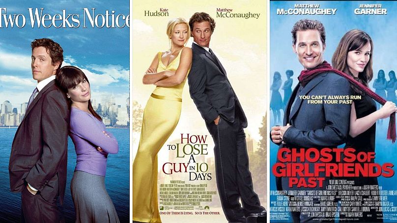
This all-pervasive design has descended into rom-com cliché by now.
Everything about this bare-minimum trend is there to tell you: ‘Hey, look at these guys – they won’t get on at first, they’ll have a rough time getting there, but you can bet that they’ll end up together by the end of the movie.’
Think pretty much every Matthew McConaughey film before the McConnaissance.
All you do is replace the background and lather, rinse, repeat. None of them are good, and after a while, you do start to genuinely wonder if the reason the actors and actresses aren’t establishing eye contact is because of the pay inequality between male and female performers.
Verdict: Back off. And equal pay already.
BACKSIDES
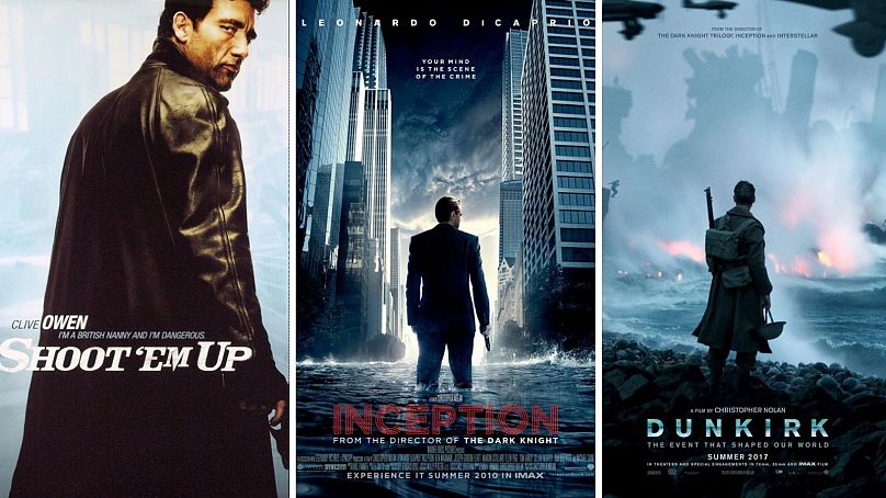
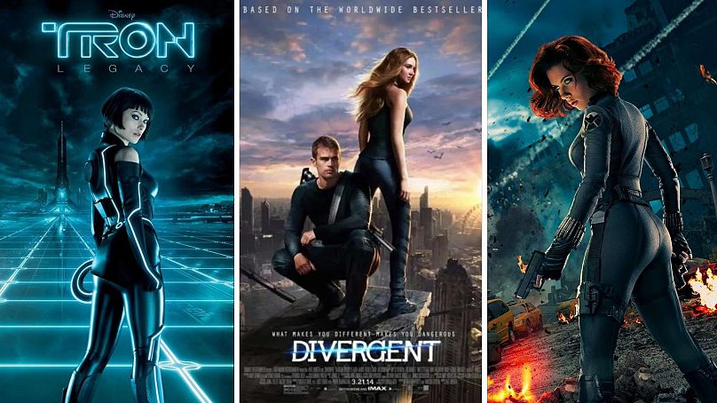
Another overused design is the main character turning his back to the audience to make him (rarely her) look mysterious or dashingly heroic.
While this can make for an effective image, the cookie-cutter design stopped working a while ago.
And when it comes to women turning their backs on posters, it’s to use the shot and angle to predictably highlight curvature.
Verdict: Bummer.
OVERCROWDING & THE SAME OLD MARVEL
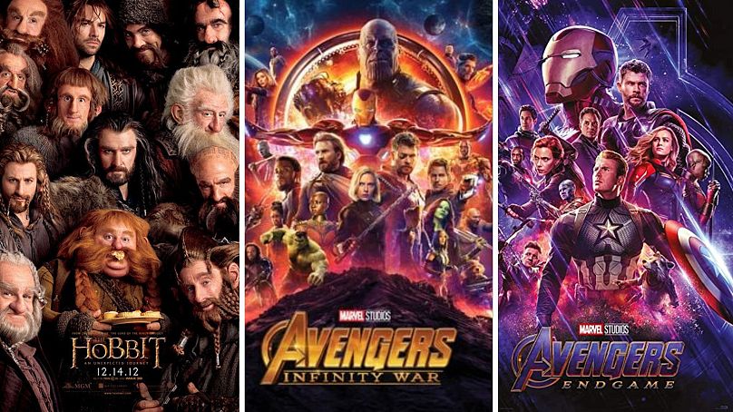
This one has been around for a while, and you’d think the likes of Marvel would start to subvert expectations after a while, especially since the MCU gets a lot of flak for being consistent yet depressingly predictable at this point.
Superhero fatigue is real, and the posters aren’t helping. They are almost unanimously ensemble photos with a central hero surrounded by the supporting cast, and it’s mind boggling how Marvel haven’t considered branching out more. Budget is clearly no issue, so why stick to this lazy visual overload?
Granted, the MCU has inspired itself from the classic Star Wars posters but they’ve taken it a step further by overcrowding their posters, meaning that there’s little composition and it’s hard to tell where your eyes should go.
As a hard and fast rule, anything that is heavy on the eye means that the content doesn’t always stand out and the message gets lost.
Verdict: Change it up a bit. Scratch that – a lot.
ALL EYES ON ME
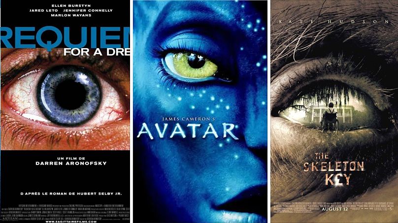
The use of eyes is a common poster tactic, especially when it comes to the horror genre.
The extreme close-ups convey fear, as well as a sense of claustrophobia or even anxiety. It’s a canny tactic to spell out the fact that the audience can expect a scary or tense movie, but the cheap trend is genuinely overdone at this point.
Quite how Avatar fits into this, we have no idea. Do better, Cameron.
Verdict: B-eye now.
MINIMALISM FOR THE WIN
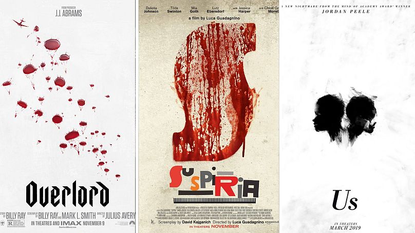
The flipside to the eye and overcrowded trend has been going for more minimalist designs. And these more subtle posters are very effective.
They rely on interesting fonts or strikingly simple images that not only subvert expectations when it comes to colour palettes but feed curiosity and bolster a sense of unease.
Any use of abstraction or Saul Bass-style simplicity (think the posters for Hitchcock’s Vertigo or Psycho) tends to give the poster a sleek and timeless look that eliminates any superfluous elements and brings about a palpable sense of atmosphere.
Verdict: Less is more.
THE POWER OF STRIKING IMAGES
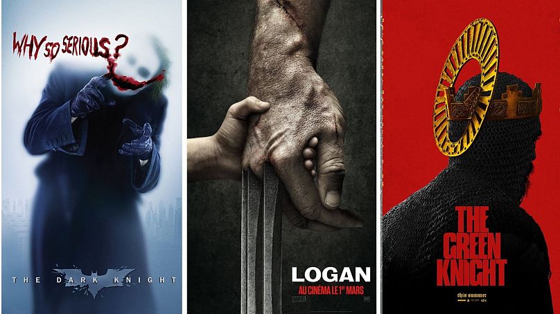
Obvious though it may seem, not every marketing team has gotten the memo...
This trend is the strongest one, and tends to often go hand in hand with minimalism. It benefits from some bold, evocative and inventive imagery to better draw the eye.
And the results speak for themselves.
Verdict: Always.
TEXT ON FACE
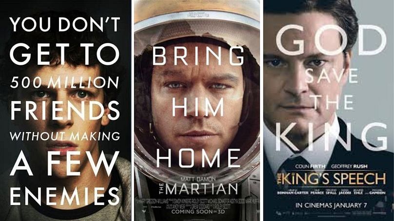
This trend seems to be dying now, but for a while, all you could see on posters was a HUGE TAGLINE on the main protagonist’s face. Most Matt Damon films featured this for some reason.
Sure, a tagline is important and a great way to market a film. However, typing it all over an actor’s face is a pretty unimaginative tactic. Worse, it ends up distracting the potential viewer from the title of the film itself. And then how are they going to know what to ask for when buying a ticket?
Verdict: Be gone.
FLOATING HEADS
Like the text-on-face trend, the persistent floating heads tactic is uninteresting and says very little about the film. Instead, the poster ends up advertising disembodied stars rather than the film.
Verdict: Let it die.
TINY PEOPLE ON BEACHES OR WATER WITH GIANT HEADS FLOATING IN THE CLOUDS
Yes, this is a thing and it must stop.
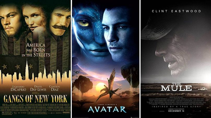
LOOK HOW PRETTY HIS BIG FACE IS!
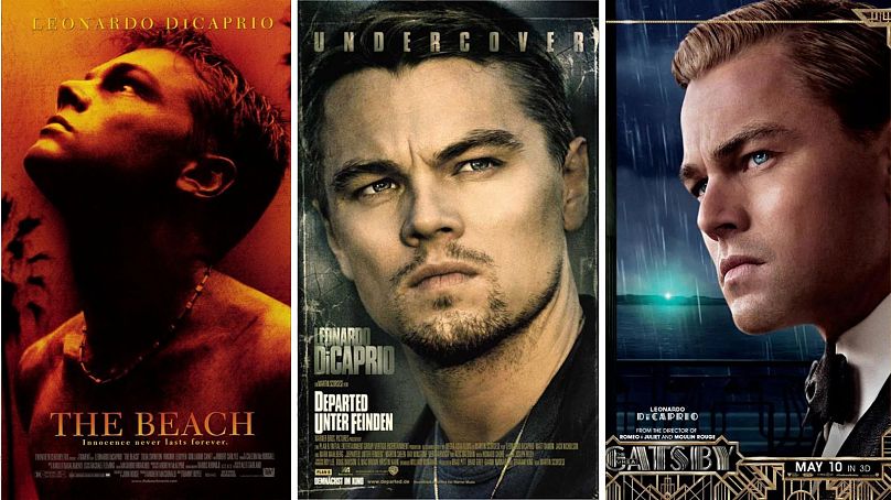
Yes, Leonardo DiCaprio is a smokeshow and a box office draw. So it seems understandable that marketers would want to focus on the leading man’s face as much.
However, these giant face posters end up giving no indication of what the film will be about and only bank on the loin-burning effect of Mr. Handsome.
Verdict: Ah, if you’ve got it, flaunt it.
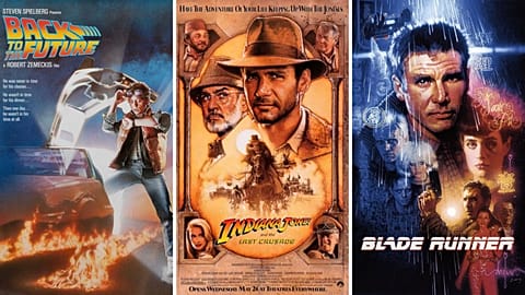
TRADITIONAL ILLUSTRATION & VINTAGE THROWBACKS
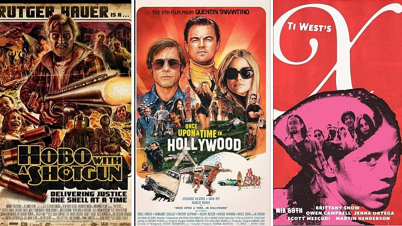
Visually speaking, illustration was the dominant artistic technique until the 1980s. From then onwards, illustration practically disappeared in favour of photography. But it’s making a comeback, as many designers have come to the realization that some of the most memorable posters in film history are those with original illustrations. Think of artist Drew Stuzan’s work for films like Indiana Jones, Blade Runner, Star Wars, The Goonies, Harry Potter and countless others.
The revival of textured, non-photographic poster designs assures that the posters feel like instant classics.
Then there’s the Grindhouse / B-movie poster trend that harks back to exploitation movies of the ‘70s. These also feature illustrated artwork and evoke the style of the movie that the poster is marketing.
Verdict: Keep ‘em comin'.
VIBRANT COLOURS
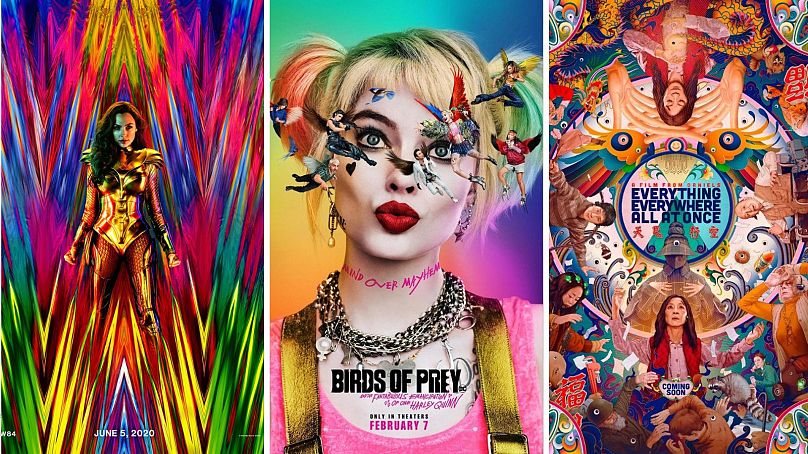
This is one of the more exciting trends in recent times, and the Barbie poster anchors itself within this style.
A bright and bombastic colour scheme is not for every film, granted, but it calls up a sense of excitement and is instantly eye-catching.
Verdict: More of this please.
NEGATIVE SPACE
The use of negative space has been getting some traction over the years, and Yorgos Lanthimos (The Lobster, The Killing of a Sacred Deer, The Favourite) seems to favour this approach.
Similar to minimalism and the complete antithesis to the overcrowded superhero movie poster, this less-is-more tactic understands that absence often speaks volumes. The strong use of negative space is also an effective way to direct the observer’s eye to a particular detail or focal point.
Verdict: Overabundance is overrated.
HUMOUR WORKS
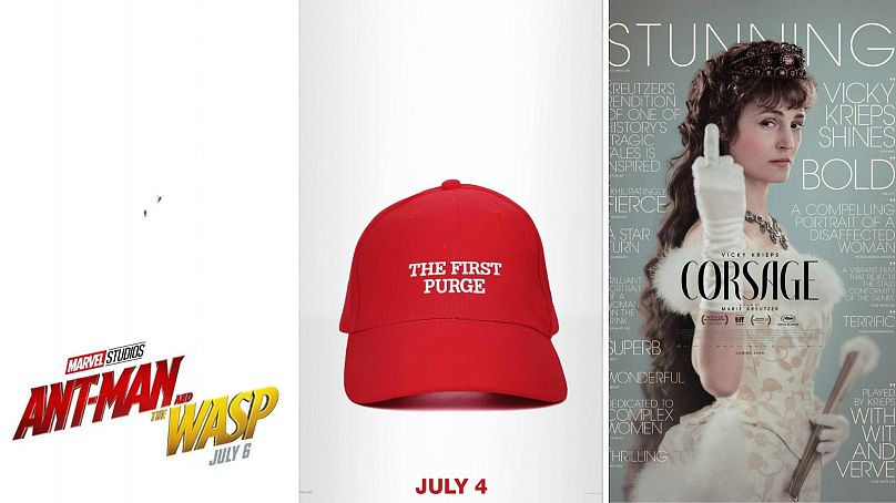
Keeping your posters funny or cheekily topical creates complicity with the potential audience member, who is more likely to shell out for a ticket knowing that the marketing team have a sense of humour.
And as proof that Marvel has the potential to think outside the box, their Ant-Man film posters have been both fun and inventive. More of this.
Verdict: Titter for a ticket.
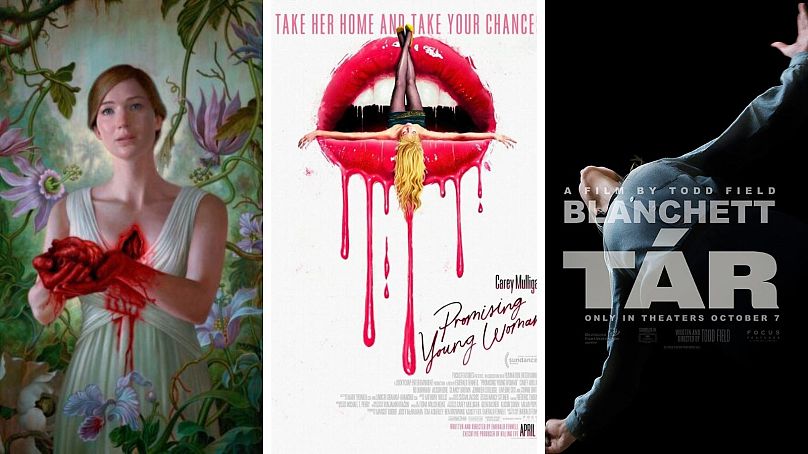
SIDING FOR SEXY
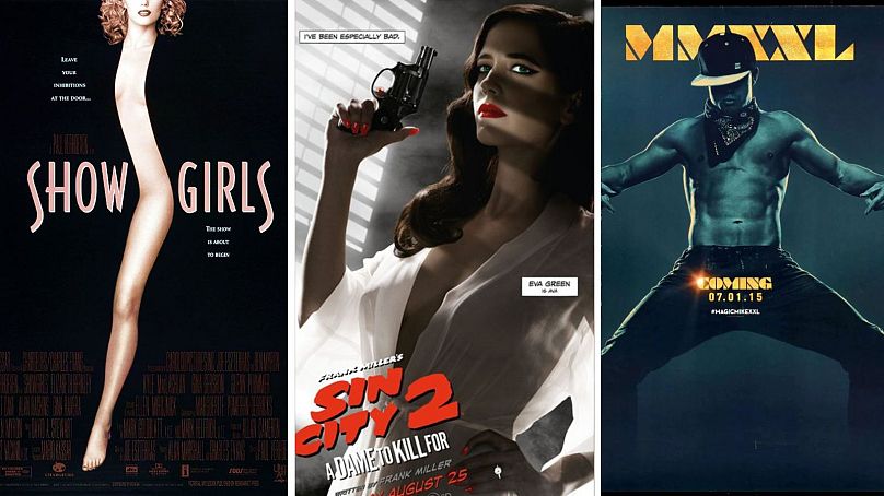
Ah, yes – the old classic.
The use of titillating images or even the mildest of provocations in advertising has always worked and ensured that products are sold through sex appeal. Mixed with humour (see: Magic Mike XXL) and you’ve got a winning combination.
Verdict: Cheap trick, but sex still sells.
Barbie opens in theaters on 21 July.