


This meteorologist is improving communication of key weather and climate events by explaining them to those not in the scientific community.
Scott Duncan is social media's favourite meteorologist. Based in London, Scott primarily forecasts for energy and power markets across Europe, with a heavy focus on renewable energy. More recently, he turned his attention to improving communication of key weather and climate events to those not in the scientific community. His work has received international recognition and has gone viral on several occasions.
Plagued with exceptional heat waves and record-breaking extremes, 2021 came in as Earth’s 6th hottest year on record according to NASA. But how does 2021 compare to various decades in the past century?
In order to keep track of our warming planet, climatologists refer to an ‘average’ as a way of benchmarking the progression of global temperature. The preindustrial average (usually taken between 1850-1900) is used to track temperature change since the industrial revolution. And the global average temperature for the year 2021 was approximately +1.2°C warmer than this preindustrial average - according to Berkeley Earth.
While this preindustrial average remains very important for tracking human impact on our climate, the pre-industrial climate average may be difficult to comprehend, given that it is based on a period before our time. As the climate rapidly warms, our individual perception of ‘average’ can change. There is often public confusion around the ‘average’ global temperature in which meteorologists and climatologists refer to.
Let’s explore some of the different climate averages (often referred to as ‘baselines’) over the last century and see how they look compared to 2021, starting with the last decade.
Comparing the global average temperature of 2021 to the 10-year average of 2011-2020 yields - a map that looks like this.
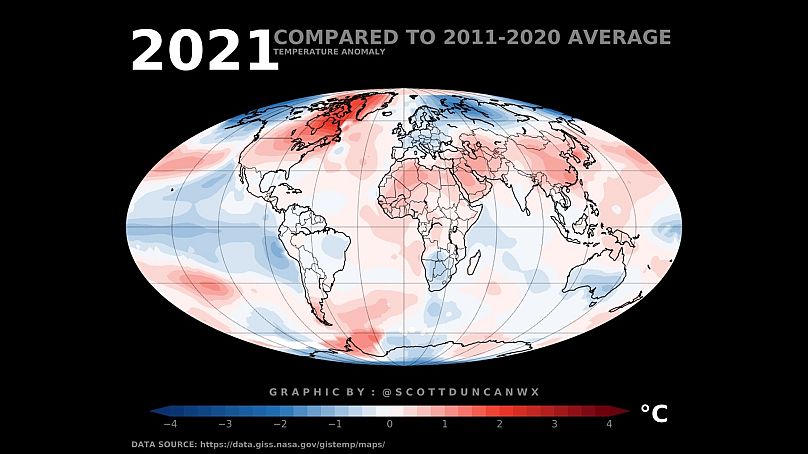
The red represents where 2021 was warmer than the last decade average, and the blue shows where it was cooler. There is plenty of variability across the globe. For example, 2021 was cooler than the average of the last 10 years for many countries, including almost all of Europe.
This doesn’t necessarily say 2021 was a cold year, the last 10 have just been very warm. Unsurprisingly, the nine hottest years in recorded history (globally) exist within the last 10 years and 2021 lies in 6th place.
Notice the red shading over Africa, Asia and especially North America. 2021 was warmer than the average from the last 10 years. Meanwhile Australia, Southern Africa and the Pacific join Europe as cooler than this 10-year average.
Cooler than average conditions can be closely linked to La Nina, a climate phenomenon that cools the sea surface temperatures in the eastern Pacific.
However, comparing 2021 to just 10 years of data doesn’t tell us much about a longer-term average. Meteorologists and climatologists usually use climate baselines running over at least 30 years.
So let’s compare 2021 to the average of the last 3 decades (1991-2020).
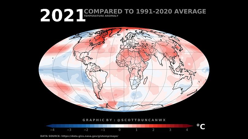
Notice the slight amplification of the reds and muting of the blues.
This tells us that the average of 1991-2020 is cooler than that of the last decade. Let’s step further back and compare 2021 to the 1961-1990 baseline.
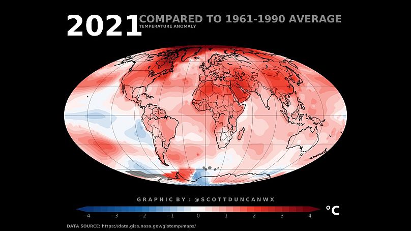
2021 holds very few places on the planet that are cooler than the 1961-1990 baseline. Many places across the world (including Europe) appear relatively ‘cool’ when compared to the last decade but are considered ‘warm’ when compared to the 1961-1990 average.
The La Nina signal in the pacific appears weaker with the only noticeable land-based cold anomaly found locally in Antarctica. Antarctica recorded an unusually severe cold season in 2021. Some of the most striking reds around the Arctic indicate rapid Arctic warming or ‘Arctic Amplification’.
The Arctic is warming much faster than the rest of the globe, latest research estimates that the Arctic has warmed four times faster than the global warming average rate since 1980.
Let’s step even further back…
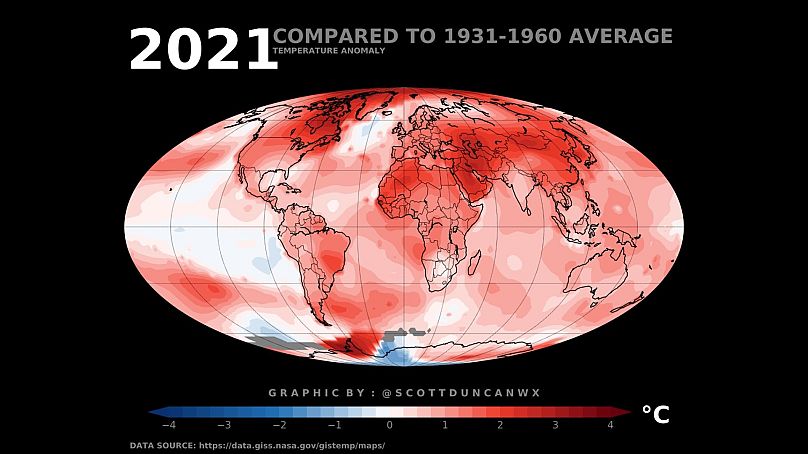
When comparing 2021 to the 1931-1960 baseline, the La Nina signal in the Pacific has effectively disappeared.
Almost the entire planet is shaded red, flagging the fact that 2021 is warmer than the 1931-1960 average virtually in every country. Only the local cold core in Antarctica stands out on the warm planet.
Another way of looking at this climate baseline comparison can perhaps link our global warming trend to something more personal and relatable. Our grandparents and great grandparents would have rated 2021 an extremely warm year across the globe when comparing to a baseline from their youth.
Those of us born in the last couple of decades only have warm years to compare and rate 2021 among one of the cooler years in the last decade.
The fact that these climate baselines continue to warm, is the definition of climate change itself.