Things are definitely not as bad as you think.
If you think the world is doomed and everything is going downhill, you are wrong, but you are not alone.
 ADVERTISEMENT
 ADVERTISEMENT
The media tends to focus on daily isolated events, paying less attention to the slow and broader developments that have reshaped the world we live in. Sadly, this tends to paint a misleading picture of the state of things.
But in the name of enlightenment, let’s look at some of the hard, factual data about some of the most important indicators of wellbeing, health, and show you how things are not as bad as you might think.
We will use data from Our World in Data, a respected and transparent scientific online publication based at the University of Oxford that focuses on quantifying and analysing data about global problems.
Wellbeing indicators show overwhelming progress
Across many of the most important indicators that define our wellbeing, humanity is faring much better than ever before.
Child mortality, famine and poverty are at all-time lows, and life expectancy is at an all-time high.
"Significant strides have been made in increasing life expectancy and reducing some of the common killers responsible for child and maternal mortality,” says the United Nations.
“Major progress has also been made on increasing access to clean water and sanitation, reducing malaria, tuberculosis, polio and the spread of HIV/AIDS”.
Let’s take a look at some of these numbers and what they say about the state of humanity.
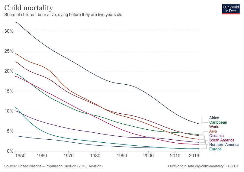
Child mortality is at an all-time low
In demography, child mortality refers to the death of children under the age of five.
And today, child mortality is the lowest it has ever been.
In less than three decades, the figures have more than halved, from 12.5 million in 1990 to 5.2 million in 2019.
“This is a huge accomplishment that should not be overlooked,” say the authors of the Child and Infant Mortality report at Our World in Data.
Of course, the death of every child is a tragedy, and far too many children – still 5.2 million each year – die because of causes and illnesses we know how to prevent and treat.
In fact, if the whole planet had the same child mortality rates as the European Union – which is considered the best-off region with a rate of 0.4 per cent – only 540,000 children would die.
But despite this, humanity has made substantial progress.
If today's figures reflected the global mortality rate of the 1800s, which was around 43 per cent, then 61 million children would be dying each year - over 10 times more than today.
Childbirth is much safer
Hooray for mothers too, who are also surviving childbirth at a much greater rate than they were just a few generations ago.
In 2015, the number of women who died while giving birth to a baby was 302,700.
Across most of the world, the risk is less than 1 per cent, and in most countries, it’s even well below 0.1 per cent.
Let’s compare that with 1800, when in Sweden and Finland, nearly 1 in every 100 women died while giving birth.
If this scenario was still a reality across the globe, each year around 1.26 million newborns would have lost their mother at birth. Thankfully, that’s not the case.
Life expectancy more than doubled in a century
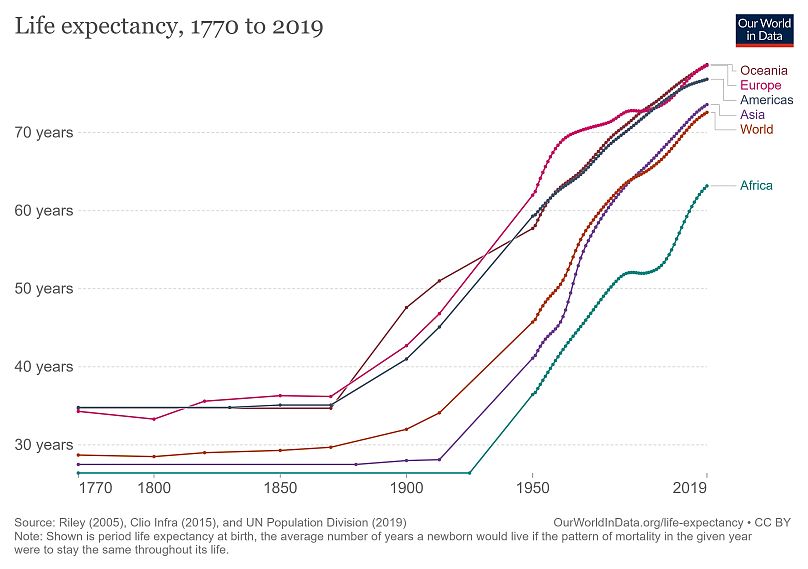
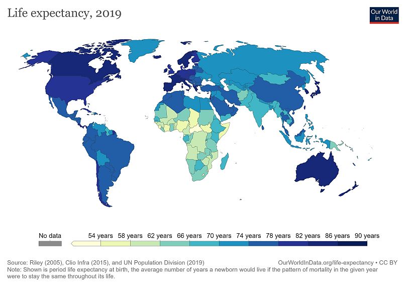
Life expectancy is the key metric for assessing population health: It tells us the average age of death in a population.
“Over the last 200 years, people in all countries in the world achieved impressive progress in health that lead to increases in life expectancy,” says Max Roser, founder and editor of Our World in Data.
Estimates suggest that in the pre-modern world (pre-18th century) life expectancy was around 30 years in all regions of the world – which is astonishing since even our hunter-gatherer ancestors are believed to have lived around 32.5 years.
However, since the 1900s, the global average life expectancy has more than doubled and the United Nations estimates a global average life expectancy of 72.6 years.
We are also living healthier for longer, meaning our quality of life during our late years has gotten better.
What about poverty?
We look at poverty as a health indicator because poverty is a major cause of ill health.
Data shows us that where there is a lack of free and accessible healthcare infrastructure, mortality rates surge.
But how can we evaluate poverty? Surely it is a complex equation?
Our World in Data researchers say looking at data from 30 or even 50 years ago is not really enough to grasp the evolution of poverty around the world.
“When you only consider what the world looked like during our lifetime it is easy to think of the world as static – the richer parts of the world here and the poorer regions there – and to falsely conclude that it always was like that and that it always will be like that,” says Roser.
So we need to look some 200 years back before the time when living conditions really changed dramatically, “and then it becomes abundantly clear that the world is not static at all”.
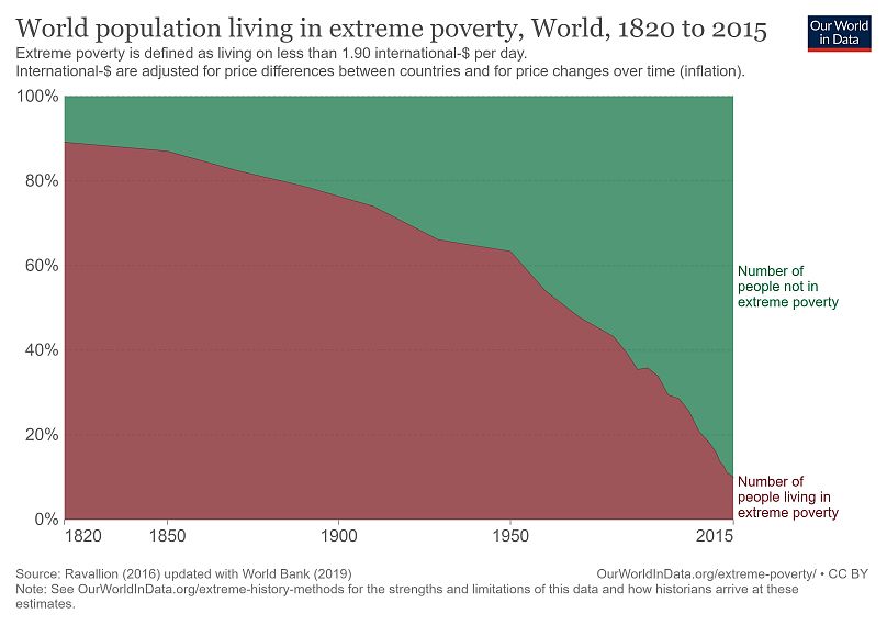
For reference, the United Nations measures “extreme poverty” as living on less than $1.90 per day.
In 1820, only a small percentage of the world’s elite enjoyed high standards of living, while the rest lived in conditions that would be considered extreme poverty today.
After that, the share of extremely poor people dropped, continuously.
In 1950 two-thirds of the world lived in extreme poverty; in 1998, 42 per cent.
In 2015, the last year for which the scientific publication has data, the share of the world population in extreme poverty had fallen below 10 per cent.
“That is a huge achievement, for me as a researcher (...) maybe the biggest achievement of all in the last two centuries,” says Roser.
He adds that the figures are particularly remarkable if we consider that the world population has increased seven-fold over the last two centuries, “which could have resulted in less and less income for everyone, and to drive everyone into extreme poverty. Yet the exact opposite happened”.
If a media outlet wanted to depict the great rollback of poverty in its headlines, Roser suggests it would need to state: “The number of people in extreme poverty fell by 130,000 since yesterday".
"And they wouldn’t have this headline once, but every single day since 1990, since, on average, there were 130,000 people fewer in extreme poverty every day,” he says.
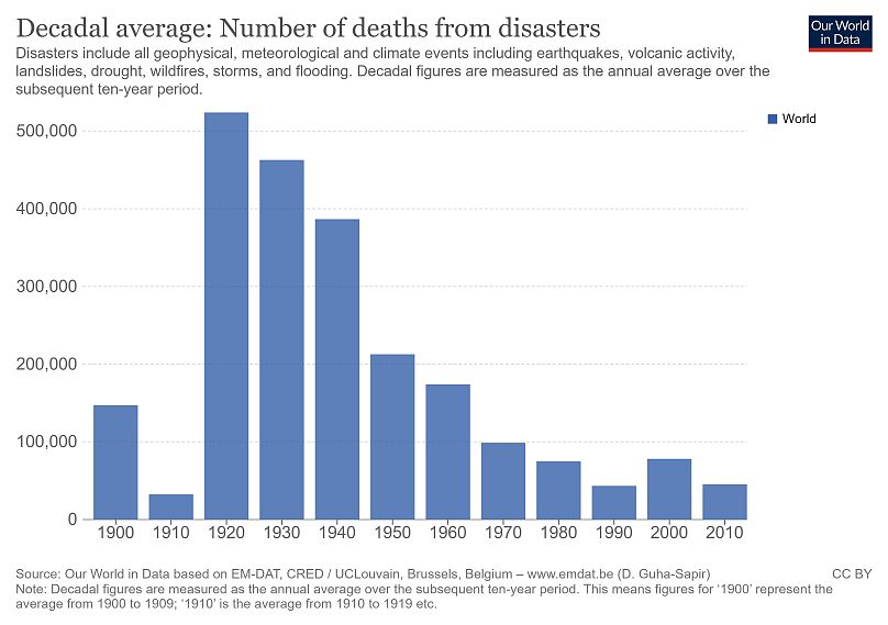
Natural disasters are getting less deadly
As Europe battles raging forest fires after a year marked by severe floods, it’s easy to feel overwhelmed by the extreme weather events unfolding on our warming planet.
So what about the number of deaths caused by natural disasters?
In the early-to-mid 20th century, the annual death toll from disasters was high, often reaching over one million per year.
But in recent decades we have recorded a substantial decline in the number of people who die in these still unpredictable events.
Our World in Data defines disasters as “all geophysical, meteorological and climate events including earthquakes, volcanic activity, landslides, drought, wildfires, storms, and flooding”.
In most recent years, the death toll from disasters is now in the range of 10,000 to 20,000 people.
In the most fatal years, those with major earthquakes or cyclones, the death toll has not exceeded 500,000 since the mid-1960s.
The numbers have decreased not because disasters have become less frequent or less destructive – but because improved food security, resilience to other disasters, and better national and international responses have made it easier to deal with them.
And unlike in the past, famines today are typically driven by civil war and political unrest, instead of natural disasters.
With almost instant updates on what’s happening in the world, we are constantly reminded of what the last catastrophe was.
But it is important to remember that this information does not give us a fair representation of how the toll of disasters has evolved over time.


