
James Cameron’s 1997 epic Titanic celebrated its 25th anniversary last December and a remastered version in 3D 4K HDR is hitting cinemas just in time for Valentine’s Day next month. But something's amiss with the new poster...
James Cameron’s 1997 epic Titanic celebrated its 25th anniversary last December and a remastered version in 3D 4K HDR is hitting cinemas just in time for Valentine’s Day next month.
The beloved movie's latest trailer and theatrical poster has been released, and instead of reigniting the age-old debate about whether Kate Winslet’s door-hogging high-society lady could have shared the floating lifeline with Leonardo DiCaprio’s doomed human popsicle, all the internet can talk about is: What in the Heart of the Ocean is going on with Kate Winslet's hair in the new poster?
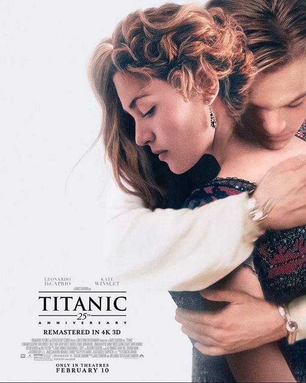
At first glance, nothing seems out of the ordinary: Jack Dawson can be seen embracing Rose DeWitt Bukater, and it all looks suitably swoon-worthy. If a little bland.
But take a second look and there are two coiffures fighting for the limelight. One half of Rose’s head has a curled updo, while the other half boasts noticeably looser waves.
A photo editing kerfuffle betraying the fact that it was a rather naff rush job? Or the visual representation of Rose’s duality as the shackled and uptight socialite she once versus the woman liberated by true love she becomes?
Whichever way you take it, Twitter didn’t waste a minute in commenting on the poster mishap:
Not that this is the first time the marketing team should have been fired.
No matter how embarrassing #HairGate is, it’s nothing compared to these Photoshopped-to-hell-and-back poster fails:
King Arthur (2004)
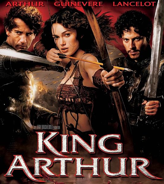
Hate Hollywood? No one would blame you, especially when they insist that an actress – in this case Keira Knightley – needs to be airbrushed to have bigger breasts to sell the film. Shame on you.
Spiderman 2 (2004)

Kirsten Dunst gets a freakishly long arm which bends in all sorts of strange ways. And don’t get us started on Spidey’s bulging bicep.
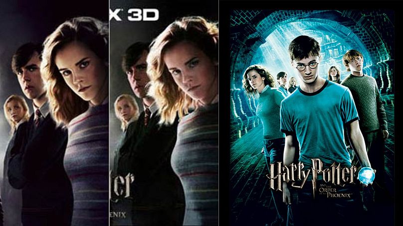
Harry Potter and the Order of the Phoenix (2007)
It's King Arthur all over again...
Seriously, why would anyone enhance the bust size of 17-year-old Emma Watson?
Warner Bros. did say that this version of the poster had not been approved and apologized. Still, don’t. Just don’t.
Also, why does Ginny not look like Ginny in the poster on the right? Because that’s not actress Bonnie Wright – it’s just some random child. Bravo.
Bangkok Dangerous (2008)
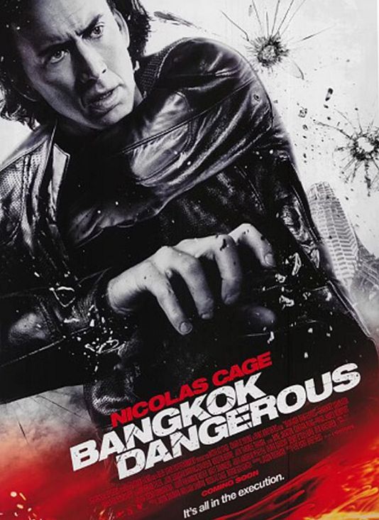
The weird pose… The disappearing arm… The suggestion Nic Cage should be holding a gun but isn’t… And what’s with those magic bullet holes?? Kill it, kill it with fire.
Takers (2010)
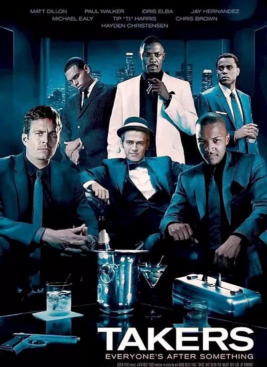
None of these heads look convincingly attached to the bodies… And what is with Hayden Christensen’s hat?
X-Men: First Class (2011)
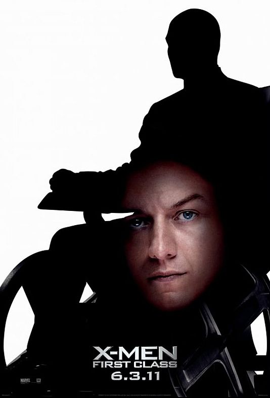
Why is Patrick Stewart’s silhouette pregnant with James McAvoy’s floating head??
The Heat (2013)
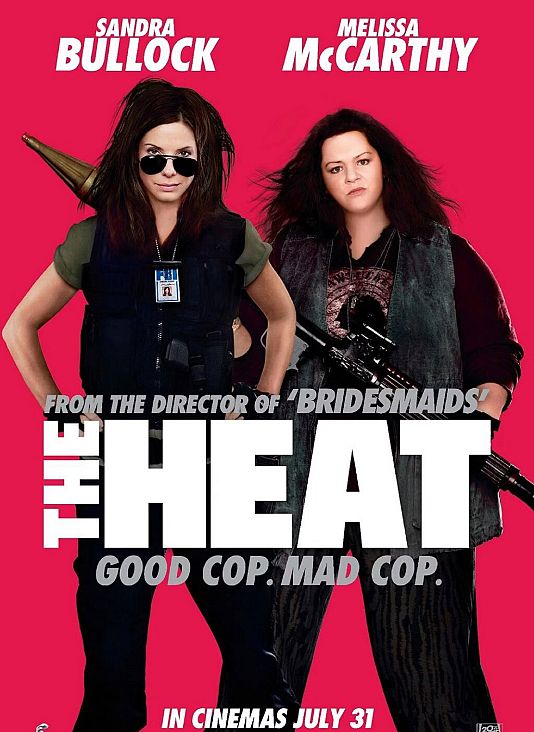
What have they done to Melissa McCarthy and her seriously airbrushed (and shrunken) head? And why does Sandra Bullock look waxy??
12 Years a Slave (2013)

12 Years a Slave was based on the 1853 slave memoir 'Twelve Years a Slave by Solomon Northup'. So why did the Italian version of the poster have Brad Pitt (who merely cameos at the end of the film) front and center?
And why is his name on the poster twice??
Ill-judged doesn’t begin to cover it.
Arrival (2016)
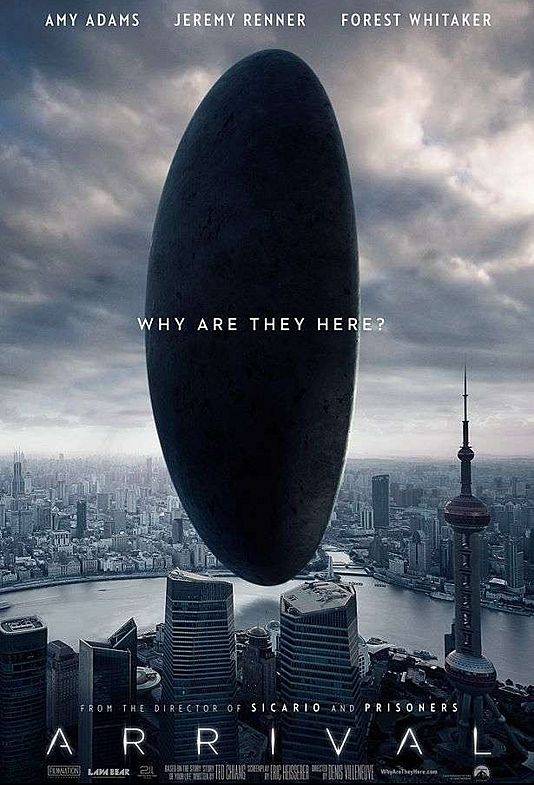
Looks fine, doesn’t it? An alien ship hovers over an Asian city.
But which one?
Going by the skyline, it’s Hong Kong. However, that tall building at the front right doesn't belong in Hong Kong. It’s Shanghai's Pearl Tower, about 750 miles away.
This version of the poster caused uproar in Hong Kong and it was removed and corrected less than 24 hours after being released.
Ready Player One (2018)

No one’s leg should be that disproportionally long…
Tomb Raider (2018)
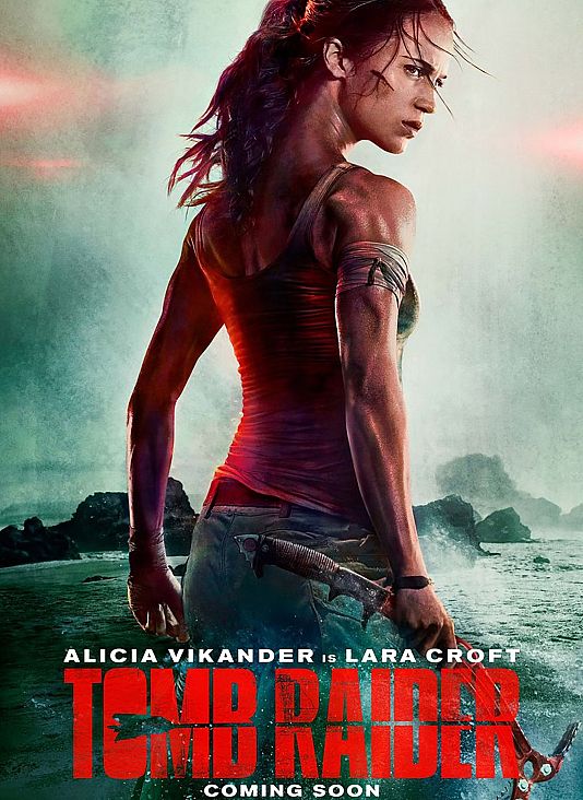
No one's spine and neck should be that giraffe-like...
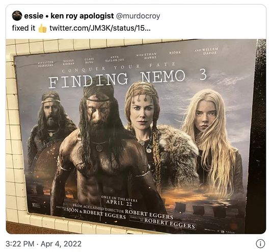
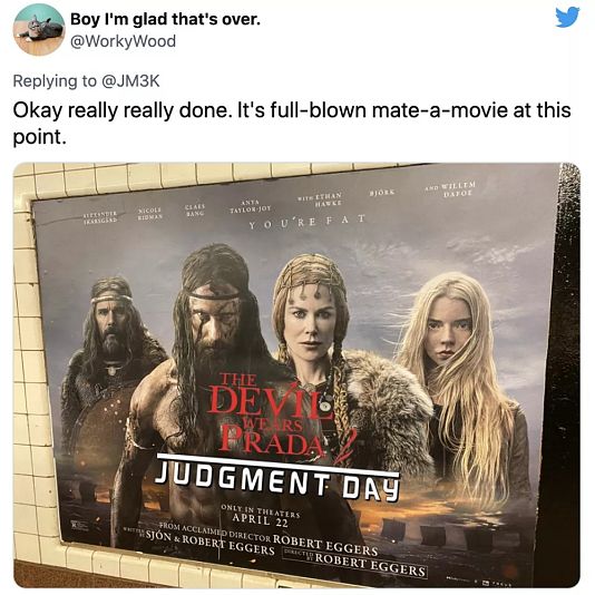
The Northman (2022)

Of all the things not to miss on a poster, the title of the film is pretty high up there.
Indeed, New Yorkers didn’t get the name of The Northman
Many thought it was a deliberate mistake. But let’s face facts: someone forgot to add the sodding title!
Still, at least Twitter had a blast:
Puts the Titanic mishap in perspective, does it not?
One of the greatest movies of all time (stop kidding yourselves, naysayers) returns to movie theaters in 3D 4K HDR with high-frame rate next month, on 10 February.


