Sans serif font is in. Red, white and blue are out.
For a diverse and growing field of 2020 Democratic contenders looking for a winning branding strategy, a lot is riding on the humble campaign logo.
Whether through color, typeface, slogan or symbol, "Democratic candidates post-2016 are seeing advantages in differentiating themselves from the pack," said Susan Merriam, a co-founder of the Center for American Politics and Design, a research group focused on the use of graphic design in politics.
"Consumers and voters have seen a lot of the same and want something different," Merriam said. "If the Democratic 2020 presidential primary is any example, the more competition there is, the more likely candidates will try and differentiate themselves through design and stand out from one another."
Merriam and graphic designer Michael Bierut, a partner at Pentagram design firm and the creator of Hillary Clinton's 'H' logo in 2016, shared their insights about the 2020 candidates' campaign logos with NBC News.
Effective political branding, Bierut says, is a delicate balance that involves the candidate's personality as well as the design.
"The candidate is more important than logo, and what will happen if it works properly is that people will associate their feelings about the candidate and project it onto the logo," he said.
What's in a name?
Democrats of both sexes and Republican women were more successful last year when they emphasized their first names, Merriam said. In 2020, several presidential candidates are also going the first-name route.
Given the potential number of septuagenarians in the race, they might be trying to seem young and relatable, the graphic designers said.
"Everyone wants their candidate to feel accessible and approachable," Bierut said.
New Jersey Sen. Cory Booker
Merriam: "As red, white, and blue are the typical choices, I don't think Booker was trying to communicate anything in particular by not using other colors. He was probably just trying to look patriotic, like a typical political logo. I think using the first-name emphasis is a more casual, friendly choice rather than 'Booker,' and the color blocks are a cool contemporary look."
Former Housing Secretary Julián Castro
Merriam: "Between the choice of the brighter blue and breaking the box, the designer clearly chose to put emphasis on the accent of the 'á.' Castro has been the only Latinx candidate to announce their run for president for 2020 thus far, and it makes sense to emphasize a quality connected to his personal narrative and which differentiates him from the field. A small nod to the Spanish language does that in a nice and subtle way."
Vermont Independent Sen. Bernie Sanders
Merriam: "I think it's a case of it's not broke don't fix it. Bernie's logo received positive responses in 2016, and clearly his campaign was fairly successful, so it makes sense he used it for his race for Senate in 2018 and now for 2020."
"The slab serif and first-name emphasis give a homegrown vibe very consistent with Sanders' populist messaging."
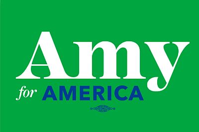
Minnesota Sen. Amy Klobuchar
Bierut: "Amy's got the only serif typeface that is anything like delicate. That must be some deliberate choice. Interestingly enough, going against her early reports of being a tough boss, who is a yeller, you see this kinder, gentler, first-name basis, in a nice pretty serif typeface."
Merriam: "Serifs tend to be considered more traditional — in particular, high-contrast serifs [in which the strokes vary from thick to thin]. This typeface is reminiscent of calligraphy and has ornamental traits rooted in typefaces of the Victorian era [and] Gilded Age. Between the font choice, the color being purply blue, and the extended color scheme we've seen her campaign use, it seems reasonable to assume the designer was making choices for a more centrist, nonpartisan aesthetic, whether intentionally or subconsciously."
Politics
South Bend, Ind., Mayor Pete Buttigieg (pronounced Boot-a-judge)
Beirut: "People are deliberately deciding to either go with their first name, in some cases because I think they're trying to be friendly and accessible, in other cases because they've got some sort of issue with their last name, which I think Mayor Pete definitely battles with."
Red, white and blue — and green and yellow too
California Sen. Kamala Harris
Harris' logo uses red and yellow, inspired in part by the campaign buttons of Shirley Chisholm, the first black woman to seek a major party's presidential nomination, a Harris campaign aide told NBC News.
Harris, whose father is Jamaican and mother was Indian, became the second African American woman to be elected to the Senate. She announced her presidential bid on Martin Luther King Jr. Day, nearly 47 years after Chisholm, the first black woman elected to Congress.
Harris said she chose her slogan because "Kamala Harris, for the people" was how the former prosecutor and attorney general of California would introduce herself in court.
Merriam: "In the 2018 election, women and people of color used colors other than red, white and blue more often than white men," including former Georgia state House Minority Leader Stacey Abrams in her gubernatorial campaign.
Beirut: "She's the one who seems to have maybe picked up on the lesson of 'Make America Great Again,' although I think that's definitely candidate-centric as opposed to the broader one that Trump's been using all along."
Former Texas Rep. Beto O'Rourke
Merriam: "The black with white lettering clearly is high contrast and bold and made Beto stand out from typical senatorial candidates, away from the red and blue. The font he chose, 'Abolition,' comes from historical typography from whisky bottles, which gives it a craft brewery vibe. Abolition is also seemingly used in Netflix's logo, so maybe Beto is trying to give off some Netflix and chill vibes."
Massachussets Sen. Elizabeth Warren
Merriam: "The campaign has named the mint 'liberty green,' which seems relevant if they are referencing the color of the Statue of Liberty, a strong woman and symbolizing liberty. The designer opted for a purply blue, and the 'liberty green' is a departure from the typical Democratic primary blue. The last-name emphasis and all-caps choice is somewhat authoritative."
New York Sen. Kirsten Gillibrand
Merriam: "Sen. Gillibrand has made a clear choice to define herself as the candidate for women, visually by using a bold saturated pink and black contrast. This aligns with her messaging as a candidate that will stand for women — be the first person to call out a senator for sexual harassment, benefit women in the military, and share her personal narrative of being a mom with two teenage sons. In her new logo, 'Gillibrand' fights visually with the larger text size and bolder color of '2020.' The choice of a sans serif typeface is fairly typical and doesn't tell a voter much about the candidate; however, the relationship of the trimmed 'R,' A,' and 'N' is nice, but very subtle."
Marianne Williamson
Merriam: "Williamson's font for 'Marianne' is fairly nondescript, so the ballet-pink '2020' stands out with the blocky cut-out-like typeface. The role of pink and purple with the first-name emphasis is clearly intended to brand herself as a clear woman candidate."
Former Colorado Gov. John Hickenlooper
Bierut: "The one I think was the most fun to work on is John Hickenlooper's, just because he's got that hopelessly long name. It's not just long, but it sounds long and crazy. A nice, long four-syllable — Jesus, that's a 12-letter name — is nothing you'd choose for your brand.
"And then he's got these stripes above it that I think are meant to represent the Rocky Mountains. It looks like somebody said, 'Governor, we've got to figure out a way around this, so how about we just use your name as the plains above which the majestic Rockies will rise?' And he took that advice.
"You get a little circle with a finite number of pixels wide [on social media], and fitting a 12-letter word in that is not an easy task. I'd much rather be Amy Klobuchar."
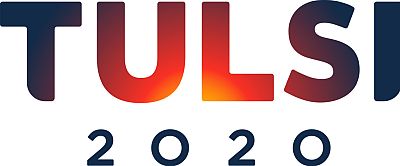
Hawaii Rep. Tulsi Gabbard
Merriam: "While I am sure the designers intended for the logo to reference a Hawaii sunrise, it definitely looks like a sunset. The colors are similar to the movie poster 'Red Dawn,' as someone has pointed out on Twitter."
Beirut: "Tulsi's thing is really weird looking, but it looks like there's an idea behind it."
Washington Gov. Jay Inslee
Merriam: "The designer of this logo seems to be referencing environmentalism with the gradient Earth-ish orb behind his last name. However, there are definitely some type crimes occurring, and it just looks really dated. I am not sure whether they intended for this to come across as retro — it just seems badly designed to me. In contrast, Harris' logo is a great example of something that intentionally has a retro feel. My fellow co-founder said Inslee's logo looked like an enterprise software or cybersecurity company from the days of the [Texas Instruments] TI-83 calculator. Frankly, if I was on the campaign I would consider crowdsourcing a new logo because it also must be really difficult to work with, designing around, printing, etc."
A traditional look
The logo designs for lesser-known, male candidates "tend to be rooted in more traditional political logos, using red, white, and blue and stars or stripes," Merriam said.
Andrew Yang
Merriam: "The idea of the italicized logo or slant indicates moving forward, speed … youth maybe? That part is not bad. The red and blue fits the logos of past presidential candidates. However, the stripes in the "Y" awkwardly interact with the 'a,' and the relationship of the title case to 2020 is also not great."
Former Maryland Rep. John Delaney
Merriam: "Like the [former Arkansas Gov. Mike] Huckabee 2016 presidential campaign logo, it is a failed knockoff of the fields in the 'O' of the Obama presidential campaign logos. Is it a reference to the campaign trail? Driving America forward? The highways across America? Infrastructure? It's vague, to say the least. What it looks like to me is the designer did not just want to use the logotype and wanted to add a little something to bring in the red and lighter blue. They did not do so successfully, in my opinion. This seems more of the level of design we see for a candidate running for the House of Representatives rather than the presidency."
Former Alaska Sen. Mike Gravel
Merriam: "Mike Gravel's logo uses a poppy red and navy color scheme with a typeface that appears to be custom and inconsistent. The typeface is not quite a serif or sans serif and has individual characters with rounded corners and some with hard corners. The icon of star and stripes is too small in the 'a.' When the logo is small the icon is minuscule."
Ohio Rep. Tim Ryan
Merriam: "Rep. Tim Ryan's logo uses a sans serif font, red- and blue-blocked color, with tight letter spacing. It is remarkably similar to Cory Booker's with the color blocking but uses a typeface with less personality than Booker's."
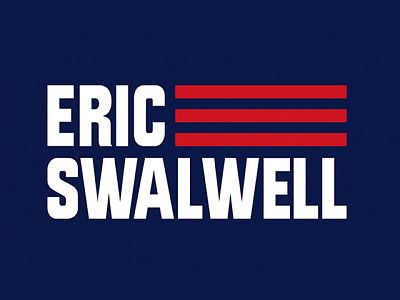
California Rep. Eric Swalwell
Merriam: "Rep. Eric Swalwell uses a condensed sans serif, classic colors, and stripes reminiscent of the American flag. This logo, while an improvement from his congressional logo, doesn't tell you too much about the candidate — a missed opportunity."
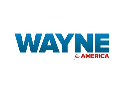
Miramar, Fla., Mayor Wayne Messam
Merriam: "Mayor Wayne Messam's logo features bold typography, first-name emphasis, classic red and blue colors, and the tagline 'for America' — not dissimilar from Amy Klobuchar's logo or popular TV show 'The West Wing's' 'Bartlet for America.'"
Meanwhile, on the Republican side ...
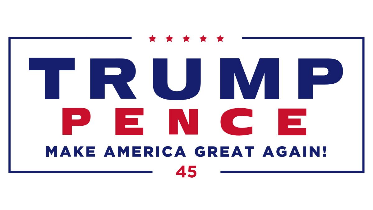
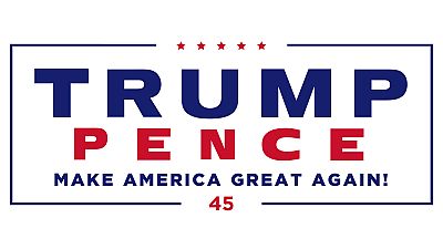
President Donald Trump
Merriam: "The stars and '45' that interrupt the rectangle outline feel like an afterthought to bring in a touch of Americana. As prior to 2016 the 'Trump' brand was well known, it's unsurprising that then-candidate Trump chose to build on that brand with emphasis on the last name, with a heavy font drawing lots of focus and attention (not unlike the candidate himself)."
